Mobile First Data Labelling for a Distributed AI Workforce
- Error rate
- ↓ 60%
- Completion speed
- ↑ 29%
- Retention
- ↑ 22%
- Workforce reach
- 6 markets
Overview
About the project
Hive Micro pays people to label the data that AI models train on: tagging objects in photographs, drawing boxes around them, transcribing audio. The tool was built for desktop, and most of the people doing the work have only a phone.
This is the redesign that moved it. It shipped on both stores, and the figures above are what moved with it: fewer misclassifications, faster tasks, and more workers coming back the following week.



Background
Who the work is for
The workforce spans Venezuela, El Salvador, Bolivia, the Indian subcontinent, Kenya and the Philippines. In most of it a phone is not the preferred device for online work, it is the only one.
The interface they met was a desktop annotation workflow shown on a small screen: touch targets sized for a cursor, zoom and precision controls that assumed a mouse, and dense instructions with no clear confirmation that a submission had landed.
That gap is not a polish problem. For many of these workers Hive Micro is not a side hustle, it is a lifeline, and a misclassification they cannot see coming costs them the task.
Approach
The Process
Research
Desk research and a competitor scan, mapping what mobile annotation already asked of workers.
Synthesis
Personas and an empathy map, built from worker testimonials rather than assumed profiles.
Ideation
Low and mid-fidelity concepts, worked against the constraints the research had surfaced.
Final Designs
High-fidelity screens, with the heaviest mobile interactions reworked around one-handed use.
Reflection
Results read against the error and completion rates the redesign set out to move.
Research
Key Findings
There was little to benchmark against — mobile annotation had almost no competitors — so the reading went into literature and worker testimonials instead. Three constraints came up in nearly all of it.
| Insight | Description | UX Opportunity |
|---|---|---|
Fragmented attention | Work happens between chores, in short bursts. | Short, resumable interactions that survive an interruption. |
Limited device resources | Entry-level phones on unstable, often prepaid networks. | A light UI, low data use, and state that saves itself. |
Gesture familiarity | Pinch and swipe are already second nature. | Let gestures replace the on-screen controls duplicating them. |
Research
What the interviews asked
Lightweight interviews with current and prospective mobile workers across Latin America, probing four things: what keeps someone working, what stops them, what their phone can bear, and what the money is for.
Motivation
What brings someone back, and what the earnings actually pay for at home.
Finding work
How hard it is to locate a task worth taking and get started on it.
Data and signal
What a week of tasks costs in data, and how often the connection drops.
The device
What phone the work happens on, and what it is shared with.
Synthesis
User Personas
Two personas carry the research, both drawn from testimonials rather than assumed profiles. They differ in the one dimension that changed the design most: whether the phone is a work device or a shared household one.
Oscar Mayenties
Oscar Mayenties
Seasonal event coordinator, Maracaibo, Venezuela
- Age
- 29
- Device
- Android, 2GB
- Peak season
- 4–5 months
Coordinates events around Carnival, Holy Week and the Christmas holidays. Outside those four or five months the income stops, and Hive Micro is what carries the gap. He works on shared Wi-Fi and public hotspots.
Goals
- Hold $100 a week through the off-season
- Build enough platform fluency for longer remote contracts
Pain Points
- English-only task hints lead to misclassification
- Instructions are hard to reach once a task has started
- No sense of whether work was accepted, or when it pays
Behaviour
- Works in concentrated bursts between seasonal contracts
- Connects through shared Wi-Fi and hotspots in public spaces
Needs
- Plain feedback on acceptance and payout timing
- Tasks that queue offline and sync when signal returns
- Spanish throughout, examples and tooltips included
Rossina Sanguinetti

Rossina Sanguinetti
Housewife and English Literature graduate, Mendoza, Argentina
- Age
- 35
- Device
- Android, 3GB
- Data
- Prepaid, shared
Found Hive Micro through a Facebook group that shares remote work, and fits tasks around the household day. One prepaid phone carries both the work and the family messaging.
Goals
- Contribute $50–80 a week to household costs
- Build confidence with platforms that could lead to freelance work
Pain Points
- Rejection or suspension arriving with no explanation
- Eye strain across long annotation sessions
- Submissions failing outright on weak mobile data
Behaviour
- Works in short sessions fitted around the household
- Shares one prepaid phone between work and family
Needs
- Tasks that pause and resume across a dropped connection
- Spanish instructions with worked examples
- Visible confirmation that a submission landed
- A light interface that loads fast on prepaid data
Constraint
One shared desktop, a phone each
Across low-income households in Bolivia, Venezuela and the Philippines the pattern repeats: a single desktop shared between everyone, and a personal smartphone for each of them, usually on prepaid data.
That settles the brief before any screen is drawn. Every critical task has to work on a 2–3GB Android phone, which rules out heavy loaders, full-resolution assets and background syncing that runs while nobody asked it to.
Delivery
The easy screens first
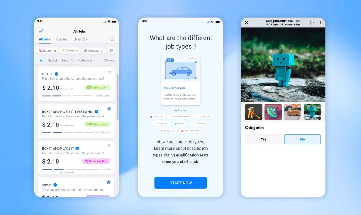
The task-interaction screens were the hard problem, so they were not the first problem. Ahead of them came everything around the task: sign-up and onboarding, the job list and the filters that cut it down, the coach marks that introduce it, and the practice tutorial that gates paid work.
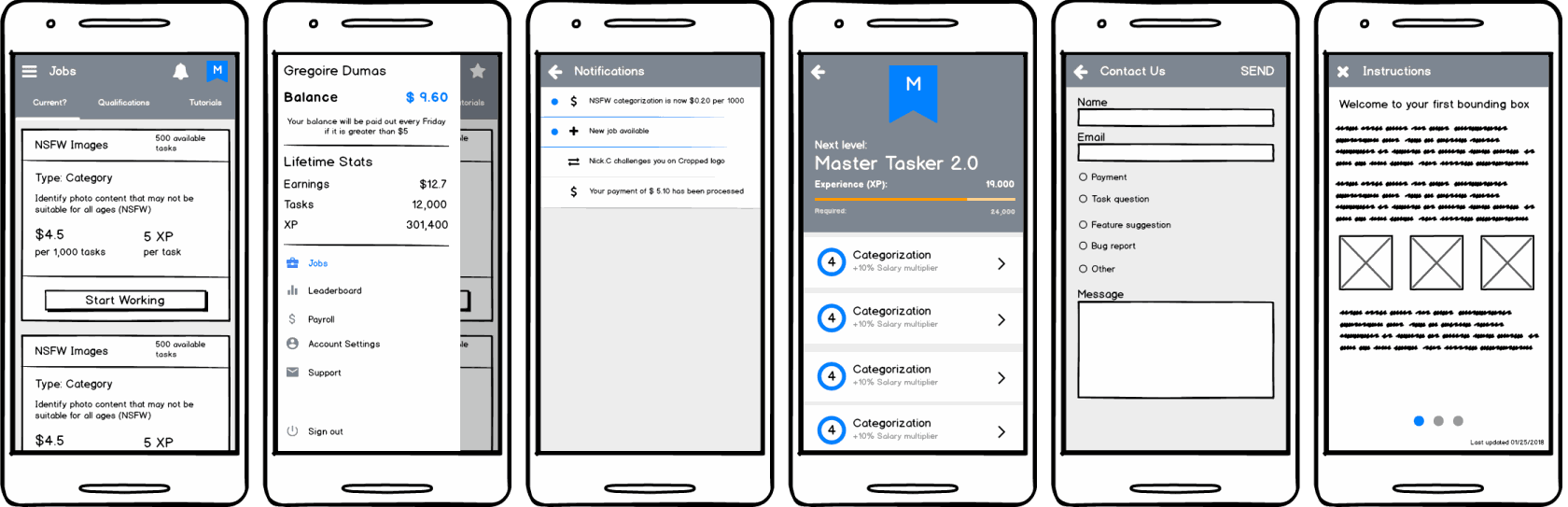
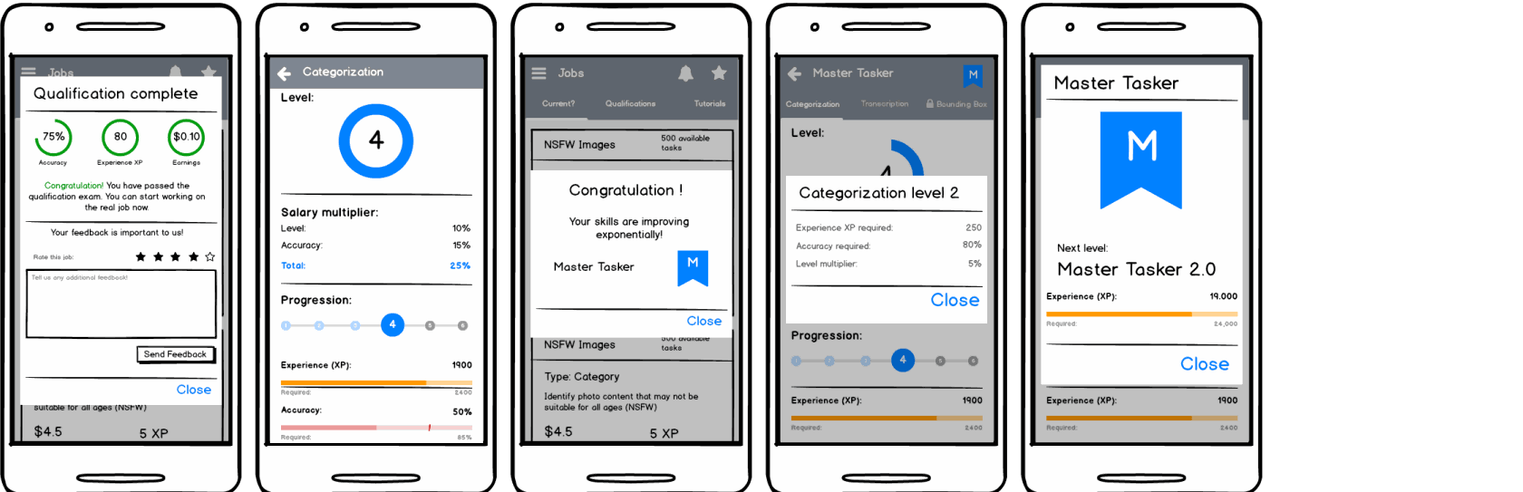
Hive Micro already had a design system and a working web product, so these could go from Balsamiq wireframes straight to high fidelity, iterating with the data and engineering teams for feasibility and API alignment as they went.
The point was parallelism. Front-end development started on settled screens while research continued on the annotation flows, which bought engineering a two-week head start and bought the task screens the time they needed.
High fidelity
Getting in
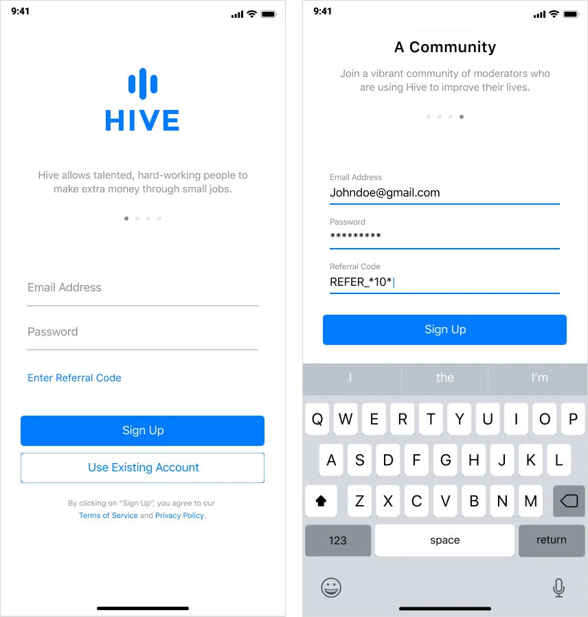
Sign-up is the one screen every worker meets, and most of them meet it on a borrowed connection. It asks for three things and explains the fourth.
- Three fields, and no more
- Email, password, and an age check. Everything else the platform needs is asked for later, at the point there is a reason to ask.
- Referral as a link, not a field
- Most people arriving have no code, and an empty input that looks required is the commonest place a sign-up is abandoned. The code opens a field only for those who came with one.
- Named before it is joined
- A community of moderators using Hive to improve their lives, said in that many words above the form. Referral is worker-to-worker recruitment, so the copy states what is being joined rather than assuming it is known.
High fidelity
Teaching the work before the first task
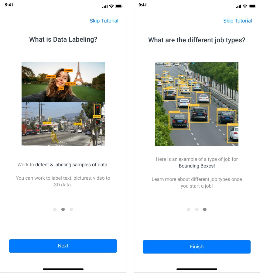
Neither persona had heard of data labelling before finding the platform. Three cards explain it before a job is ever opened, and every one of them is skippable.
- A definition in one sentence
- Detecting and labelling samples of data — with the words a worker will meet again on every job card set in the accent colour, so they are recognised rather than re-learned.
- A worked example, not a description
- The job-type card draws a bounding box on a photograph instead of defining the term. The task is visual, so the explanation is too.
- Skip stays on screen
- Skip Tutorial sits top right of all three. Someone reinstalling on a new phone should not be made to read it a second time.
High fidelity
The first run on the job list
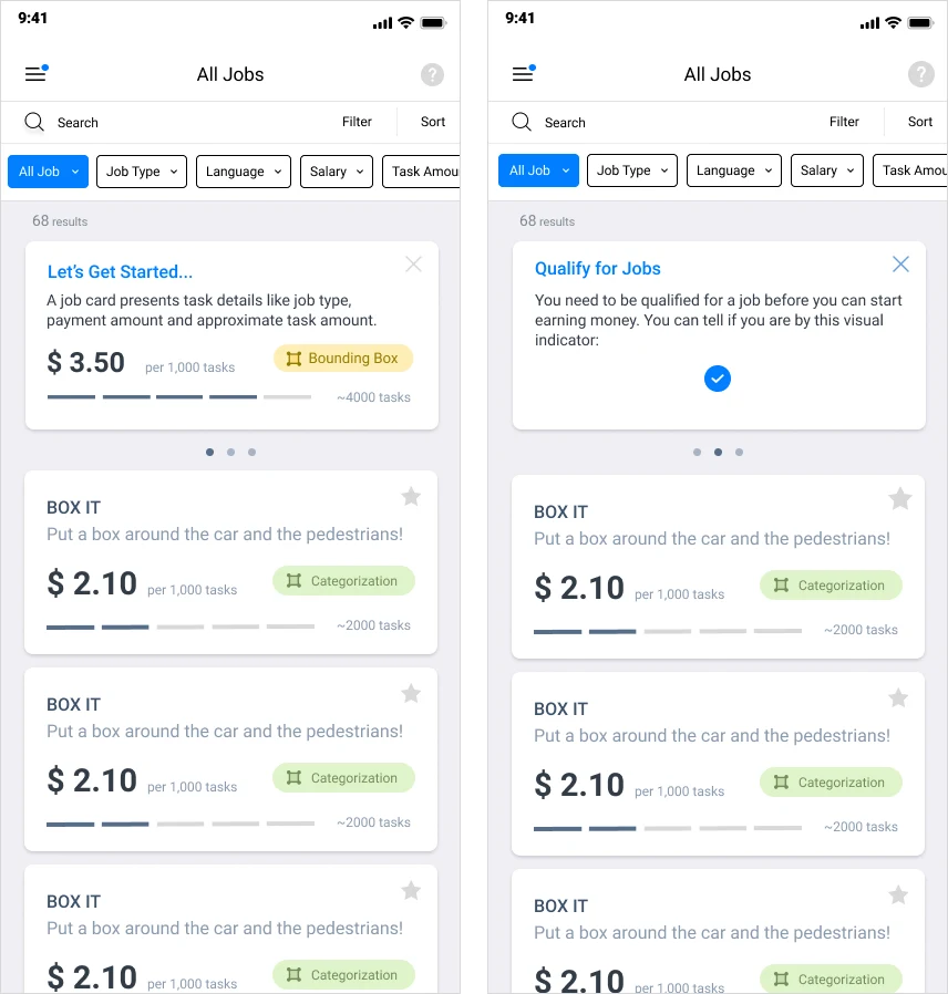
The list is the first screen carrying real density. It is introduced an element at a time, by coach marks that dismiss and do not come back.
- The card explained on the card
- The first mark points at a live job card and names what is on it: task type, pay per thousand tasks, and the approximate number of tasks left.
- Qualification before disappointment
- The second says that a job has to be qualified for before it pays. It is the rule that otherwise gets learned by being rejected.
- One thing at a time
- Three marks across three screens rather than one crowded overlay, each closing on an X, with the list underneath left usable throughout.
High fidelity
Finding work worth taking
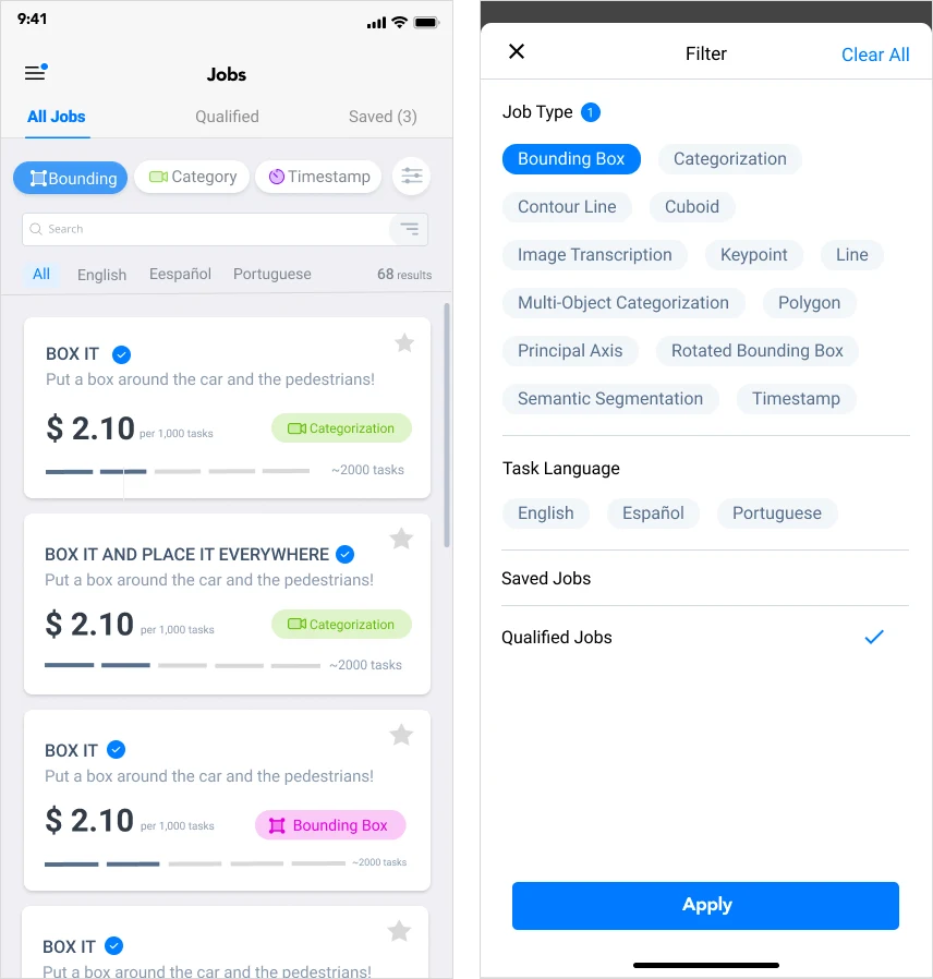
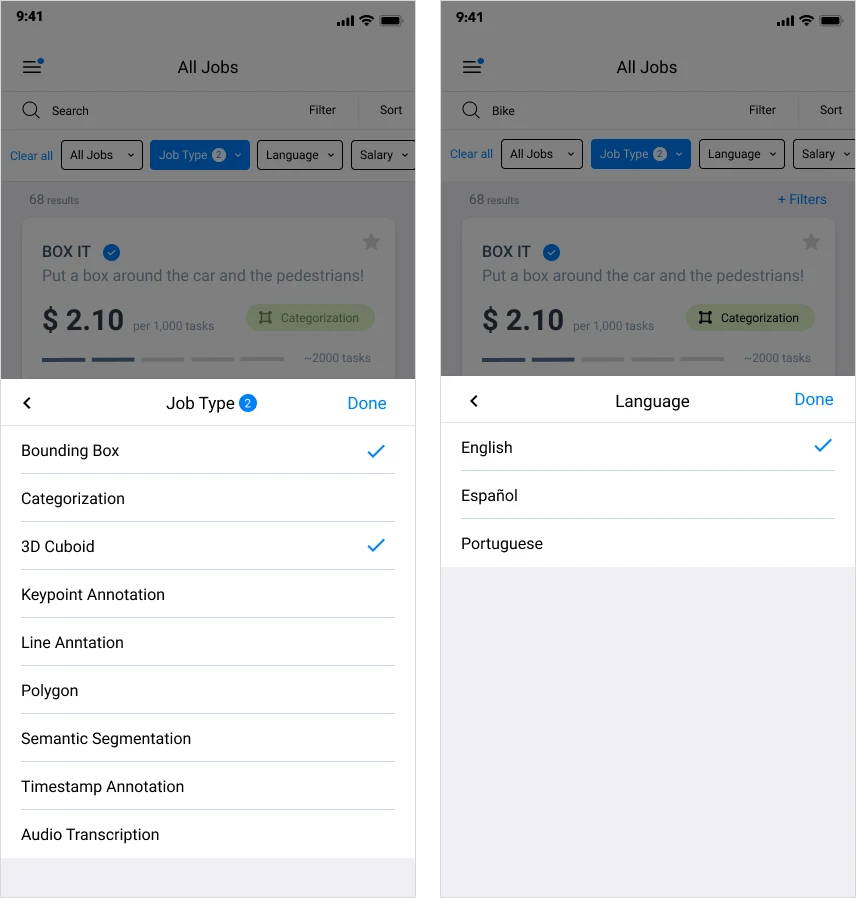
Sixty-eight open jobs is more than anyone scrolls. Filtering is what turns the list into a shortlist, and it is the part of the redesign the research pointed at most directly.
- Filters stay in sight
- Applied filters remain on screen as removable chips above a live result count, so it is always visible why the list is as short as it is.
- Job type, named not grouped
- Bounding box, cuboid, keypoint, polygon, semantic segmentation, timestamp, audio transcription. This is the filter that decides whether a worker can do the job at all, so it gets a sheet of its own.
- Language at the source
- English-only task hints were Oscar's first pain point. Filtering to Español before a task is opened removes the misclassification instead of explaining it afterwards.
- One panel to start over
- The combined filter holds job type, task language and saved or qualified jobs behind a single Clear All, so a worker can reset without backing out of three sheets.
High fidelity
Qualifying before earning
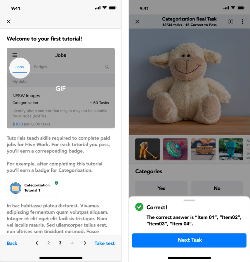
Every job type has a practice tutorial that has to be passed before the paid version unlocks. It runs in the same interface as the real task, which is the point: nothing new is met at the moment the work starts counting.
- Practice in the production screen
- The tutorial uses the real annotation interface down to the header — 18 of 34 tasks, 15 correct to pass — so the threshold is known while it is being worked towards.
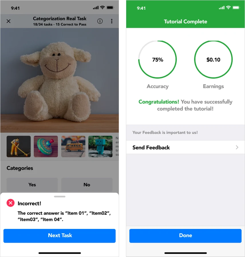
- Answers explained on the spot
- Right or wrong, the sheet names the correct answer immediately. Feedback arriving at the end of a set teaches nothing about the task that produced it.
- An exit that states its cost
- Quitting is confirmed, and the dialog says plainly what it costs: every unanswered task is marked incorrect.
- A result, pass or fail
- Completion shows accuracy and the earnings it unlocks. A failed attempt says so in the same layout rather than in an error state, because failing a practice test is an outcome and not a fault.
The hard part
Bounding boxes on a small screen
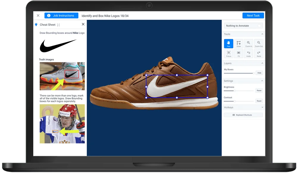
Categorization moved to mobile without much trouble. Bounding boxes did not: they ask someone to draw several rectangles accurately, pinch to zoom between them, and submit without a mistake, all on a screen a few inches wide.
The desktop original spent its space on a tri-panel productivity layout. A header carrying the job instructions, the task title and a persistent submit; a left panel holding a toggleable cheat sheet of examples and hints; the annotation canvas in the centre; and a right panel stacking pan, draw, zoom, focus, fit and undo alongside layer opacity and image settings. Almost none of that survives a phone.
Iteration
The mobile interaction model
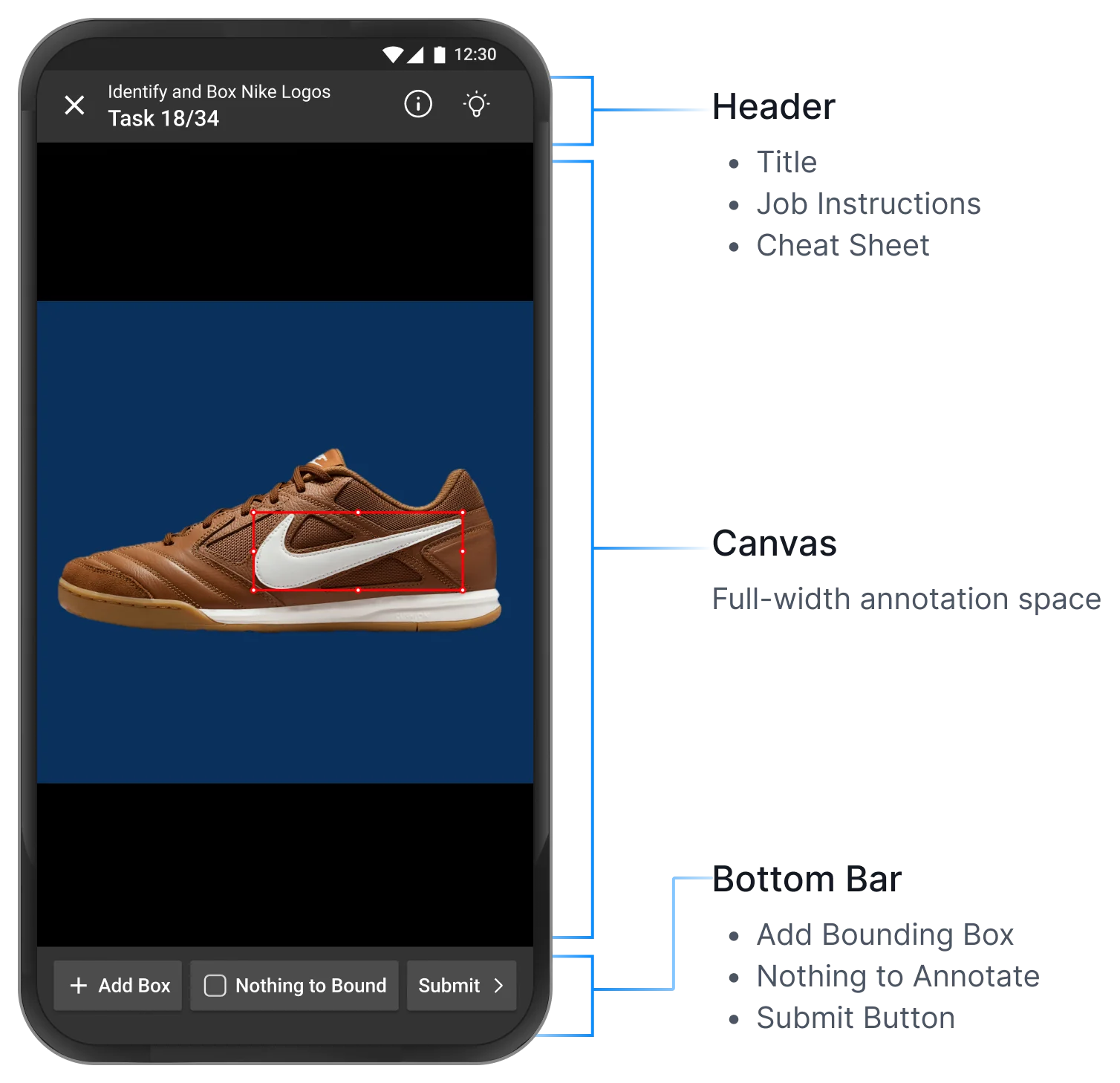
The first iteration split the screen into three zones, each with one job: explain the task, show the image, and finish it.
- Header: context without a side panel
- Task title, a Task 18 of 34 counter, and one-tap icons for instructions and the cheat sheet — the desktop header and left panel, folded into one bar.
- Canvas: the full width, nothing on it
- The image fills the width between the bars, letterboxed so any shape fits uncropped. The box is drawn straight onto it and adjusted by its handles.
- Gestures instead of a tool panel
- Pan, zoom and fit became gestures where one already existed; rarely used settings moved behind an overflow menu.
- Bottom bar: every way a task ends
- Add Box, Nothing to Bound and Submit, in one-handed thumb reach. Nothing to Bound records an empty image as an answer, not a skipped task.
Outcome
Final Design
What the annotation screen settled into, once the controls stopped competing with the thing being annotated.
Vertical hierarchy
Instructions, then image, then category — one decision per screenful.
Gesture-first canvas
Auto-fit zoom and a gesture reset, with rare settings behind an overflow.
Real-time feedback
Every action animates, so a submission is never silently in doubt.
Selective task types
Semantic segmentation stays off mobile: the precision is not there.
Reflection
What it changed
- Fewer errors
- 60%
- Faster task completion
- 29%
- More workers returning
- 22%
The redesign got there by phasing what shipped when, leaning on a design system that already existed, and refusing to move the hardest interaction until there was evidence for where it should go.
Clarity, not minimalism
Constrained environments need things stated plainly, not fewer of them.
Parallel delivery
Splitting easy screens from hard ones let design and engineering run at once.
Evidence-led iteration
Task data settled the arguments that intuition alone kept reopening.
Selective annotation
Some task types protect the worker better by not shipping to mobile.